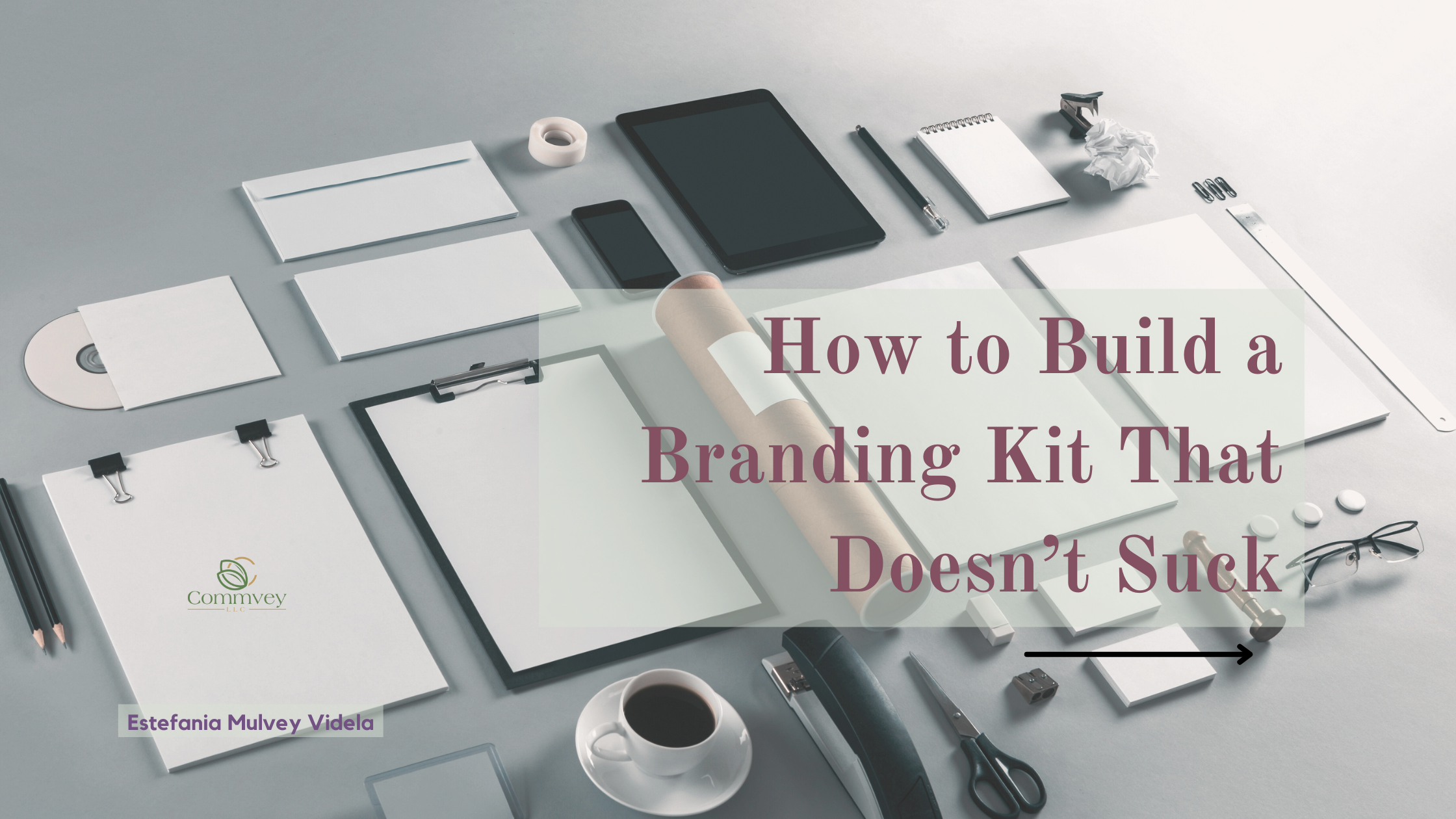
You did it. You decided to “take your branding seriously.” But before you start slapping that Canva-made logo on everything like a hot glue gun at a craft fair, let’s talk about what actually belongs in a real branding kit—and how to build one that doesn’t suck.
Step 1: Clean Up That Logo
Let’s be clear: if your logo exists only as a screenshot in someone’s camera roll from 2019, you don’t have a branding kit—you have a memory.
You need:
- A high-resolution logo (no pixelation allowed)
- A version with a transparent background (so it doesn’t sit on your site like a sad white rectangle)
- Files in multiple formats: PNG, JPG, and yes, even SVG if you’re fancy
Bonus: Have both a stacked and a horizontal version. Logos should be flexible, not fragile.
Step 2: Nail Your Color Palette (Without Assaulting Eyeballs)
Your colors should work together, not compete for attention. If your entire palette is just “loud and louder,” your audience is going to feel like they’re trapped in a Lisa Frank folder from 1997 (you know the ones—think unicorns and glitter explosions).
Tips:
- Pick a pale or neutral tone for backgrounds (ivory, soft gray, millennial blush—live a little)
- Use 1–2 bold brand colors for pop
- Don’t forget about contrast and accessibility (for real—if you put yellow text on a white background, you’re asking to be ignored)
Step 3: Mood Board That Baby
Yes, you need a vibe check. Even if you already have your brand colors, a mood board helps you map out textures, tones, photography style, and overall energy. It keeps things cohesive—not chaotic.
✨ Pro tip: “Fun colors” don’t have to mean neon. They just have to bring you joy and reflect your brand’s personality.
Want to level up without a full rebrand? Try using gradients from your existing palette. Instant glow-up.
Step 4: Images That Won’t Get You Sued
Look, if you’re still right-click–saving from Google, stop reading and go delete them. I’ll wait.
You need:
- Photos you own
- High-quality stock photos with proper licensing (free sites like Unsplash, Pexels, and Pixabay are your friends)
- And a general rule: no potato-quality memes. Have some self-respect and use high-res visuals, bestie.
Step 5: Typography That Doesn’t Make People Cry
Fonts matter. Like, a lot. They affect tone, clarity, accessibility, and how legit your brand looks.
Pick:
- A heading font (bold but not obnoxious)
- A body font that’s easy to read on any screen
- Bonus: Have an alt font for different formats (like digital vs print, or long vs short content)
And please, for the love of my millennial sanity—no Comic Sans.
Step 6: Style Guide or Brand Kit? (Tomato, Tomahto)
Some people say “style guide.” Others say “brand kit.” You can even call it a vibe bible (highly recommend). What matters is that it’s actually usable.
Here’s the difference:
- A brand kit usually includes visuals: logos, colors, photos, icons
- A style guide digs into tone, grammar, voice, writing style, accessibility, etc.
My take? Combine both. Call it whatever you want—as long as it’s not just “in your head.”
Final Thoughts: Build It Before You Need It
A branding kit isn’t just for designers or big companies—it’s for anyone who wants to show up online with confidence (and consistency).
Build it now, and save yourself from making 47 micro-decisions later. Or better yet—hire someone like us to help you create one you’ll actually love and use.
Already wondering why this even matters? Check out our post on why you need a brand kit in the first place.